
featured work
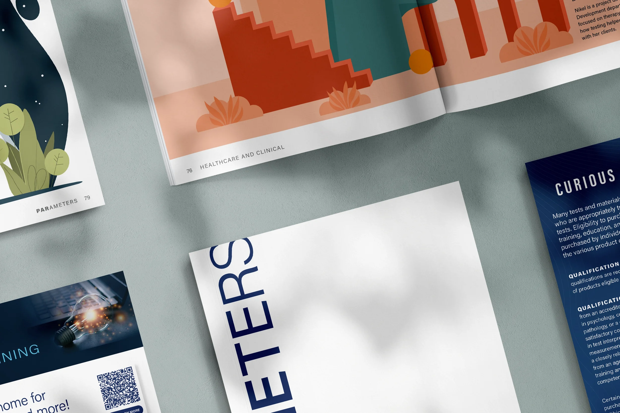
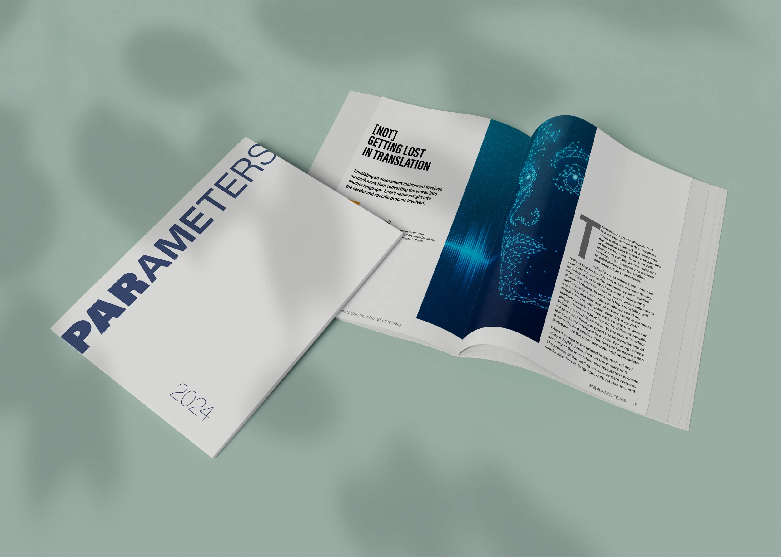
PARAMETERS
Role
Art Direction, Execution, Project Lead
Project type
Print, Direct Mail, Brand Engagement
Tools
InDesign, Photoshop, Illustrator
Target Market
Psychologists (i.e., Clinical, School, Forensic, Neuropsychologists)
An opportunity of a lifetime
In collaboration with the Product Marketing Manager, Content Marketing Manager, and Production Manager, I directed this piece from inception to pre-press. PAR, a provider of psychological assessment tools for mental health professionals, relied heavily on multiple editions of their product catalog each year, but engagement was rapidly decreasing and RTO was in the negative. To solve for this challenge, this thought leadership piece was created—providing the customer with selfless relevant content and acting as an impactful touch point to nurture their relationship with the brand.
Inspiration
Why not eliminate an expensive print piece altogether? Initially, my own bias for print was the catalyst, but during my research, our Production Manager handed me a sample from Sappi; a tome called, The Neuroscience of Touch. The paper stock was beautiful and the content priceless. Dr. Engleman’s research on the impact our sense of touch has on our brains and explanation of the Endowment Effect justified my passion for print in scientific terms—touching something deepens our level of engagement because it triggers a sense of ownership, and our brains place a higher value on our possessions. Dr. Engleman explains further that interacting with content on paper rather than digitally facilitates better mental mapping, drains fewer cognitive resources, and makes retention easier. Taking this concept one step further, he conducted a study on paper quality and found that people not only understood and remembered printed content significantly better—it also stimulated positive emotional reactions.
Execution
From determining the title, customer journey, dimensions, grid, layout, to the paper it was printed on, I was able to make every design decision. The typography and branded elements were sourced from the brand’s refresh I directed and managed. The dimensions were chosen specifically to mimic academic journals, so that the reader would subconsciously feel a wave of nostalgia while they flipped through the pages. The soft touch cover and heavy coated paper stock were selected to amplify the endowment effect and strengthen the customers’ relationship with the brand.
Highlights
The results were astonishing. In addition to increasing customer engagement by 80% and decreasing costs by +$50k per cycle (a total savings up to +$200k per year) compared to the company’s previous print catalog, the COO described this piece to the Leadership Team as, “the kind of marketing PAR should be doing.”
PARiConnect 3.0
Role
Market Research, Art Direction, Execution
Project type
Launch campaign
Target Market
Psychologists (i.e., Clinical, School, Forensic, Neuropsychologists)
Tools
Photoshop; InDesign; Illustrator
With an enhanced platform design and user interface, this online psychological assessment platform required a campaign that matched its upscaled performance and user experience.
Inspiration
My favorite composer, Johann Sebastian Bach was the inspiration behind developing this campaign. He was one of the first composers to use math, specifically geometry, as part of his process. At the time, he was criticized for blending two disciplines that live on opposite ends of the spectrum, but is now revered for being one of the greatest composers of Western music.
The enhancement of the assessment platform took a similar approach—blending data with design—to create a whole new user experience. After collecting information about the target market and developing customer personas, we tapped into these highly educated customers’ interests of both art and science.
Highlights
This campaign was so well received that it became the first campaign to hear feedback directly from customers. When the two catalog covers shown below (announcing the platform’s pre-launch and launch) dropped in customers’ mailboxes, the Customer Service department took multiple calls from customers who contacted the company specifically to say how much they loved the campaign.
The structural pop-up graphic from Red Paper Plane is even featured as the sample for their “Center Pop” product. This piece was sent to customers and used as a giveaway at conferences to announce the launch of PARiConnect 3.0.


Want to see additional campaigns for this type of target market?
Lineage Culinary
Role
Co-founder; Branding; Creative Direction
Project type
Passion project. Built from the ground up with Chef Jeremy Lett.
Tools
Illustrator; Photoshop; CMS: Squarespace
No ordinary food blog, this educational website is for all the food lovers out there who want to gain a deeper understanding of cooking—from it’s origins, to the science and technique behind it—and elevate their craft, whether it’s at home or in a professional setting.


